

Vibe Coding Beautiful Data Viz
One problem I've had with vibe coding is that it produces ugly dataviz. However, I simply used Claude to modify some of my old code, and the result is, I think, fantastic.
A few years ago, I was re-reading Edward Tufte’s The Visual Display of Quantitative Information. In that I found a really beautiful representation of New York’s weather. A while before that I had managed to get my hands on this data source that provided local weather (the Bangalore data goes back to 1980), and had spent a day making fairly nice looking graphs of Bangalore weather.
I had documented the process on my old blog here.
Soon I converted into a script that runs when I run it, gets the weather data until that morning, and then recreates that graph for that year. This is what the graph looks like for this year (so far):
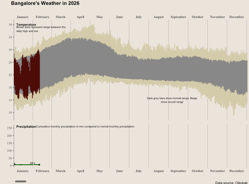
I periodically post these on Twitter, and people generally seem to like them. After all, it’s Tufte’s design. Over a period of time, I’ve got the colour scheme similar to what Tufte had proposed. The algo has stabilised. Everything is good.
Only that, when I initially coded it, I had coded this in a way that it runs for the current year. And I inevitably forget to run this towards the end of December each year, and by the time I run the script in January, the old data is lost.
So for some two years now, I’ve intended to modify the script so that it runs for any given arbitrary year in the past. Except that because it is a ~1-2 day job in my head, I’d never really gotten down to it.
On Monday, I had some time and thought - maybe I can just vibe code this. I gave my original script to Claude Code and asked it to modify it so that it can run for any given arbitrary year. It pretty much zero shotted this, and produced the new script almost instantly! (the conversation has gotten compacted so I don’t have access to my prompt; anyway it wasn’t too complicated.)
What I had thought was a 1-2 day job was done in a minute! And the output was still beautiful - because it had leveraged my existing code. One minute. Really!
Now I’m the disorganised sorts, so I don’t actually have the graphs that were produced then! They got overwritten in the next step…
Adding annotations
One of the reasons why I had started Babbage was to “spare business managers the job of interpreting data, which they are not really trained for”. That line of thought went -
Because of the profusion of data, nowadays business managers need to also interpret data apart from running their business. And this (interpreting data) is not necessarily their core competence. Traditional BI just dumps tables and graphs on you, and expect you to draw your own conclusions, and people aren’t good at that. How can we do better?
Now, Tufte’s idea is beautiful. The graphs look great. However, can we do better by adding some more commentary to it? With LLMs, we can add natural language annotations that don’t need to look boring any more.
And so I shot off another prompt. Again the conversation has been compacted but I used Wispr Flow to dictate the prompt so it has been saved (maybe I should use Wispr Flow for more of my vibe coding to save the prompts!):
Basically, I want to be able to also produce a short commentary on that year’s weather, highlighting four or five key points. You have things like:The number of days or periods when the weather was really hot or really cold or really rainyComparing this to the historical averagesLooking at the longest dry spells, number of days continuously with rain, and things like thatI mean, you need to figure out what are those things that you can do and program, and so on, to produce three key highlights of that year’s weather and add them as part of the subtitles or figure out where exactly you need to add that as part of the graph.
I think I have some cloud credits, so API credits, so you need to also write the program so that it can use that my cloud API key and things like that and uses the cloud API so that it can produce all this natural language stuff.
What I want you to do is that, I mean, I don’t want to be spending too much on LLM cost for each run, so I want you to program in such a way that:You write a lot of code that produces stuffOnly the highly necessary stuff will need to be done by Claude in each runSo think through it and write the program. I’ll approve it, and then you can go ahead and run.This time Claude was more circumspect. It asked a whole bunch of questions before proceeding. And then produced some code, which couldn’t run because I had no way to add money to my Claude API account (all my Indian credit cards are getting rejected there!).
Finally I resorted to asking it to download and use an Ollama model (on my computer), and the code ran.
After this step, there was a lot of changes I had to make. Lots of back-and-forth prompting to make it improve the annotations, put it in the right format in the right place, and all such. Finally I was happy with what it produced, and I halted the process.
Here are the weather graphs for Bangalore for the last 2 years. I THINK they should be self-explanatory.
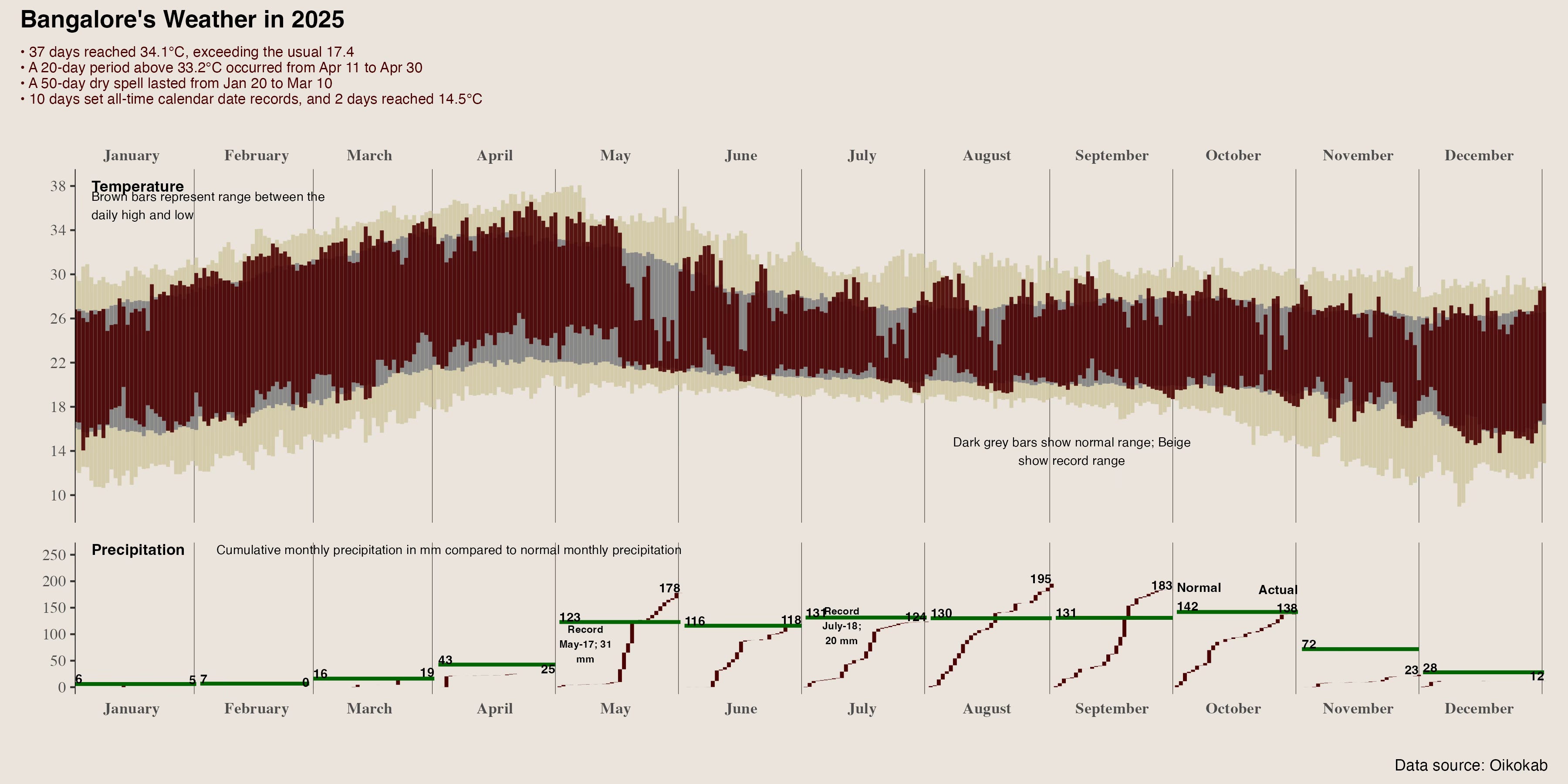
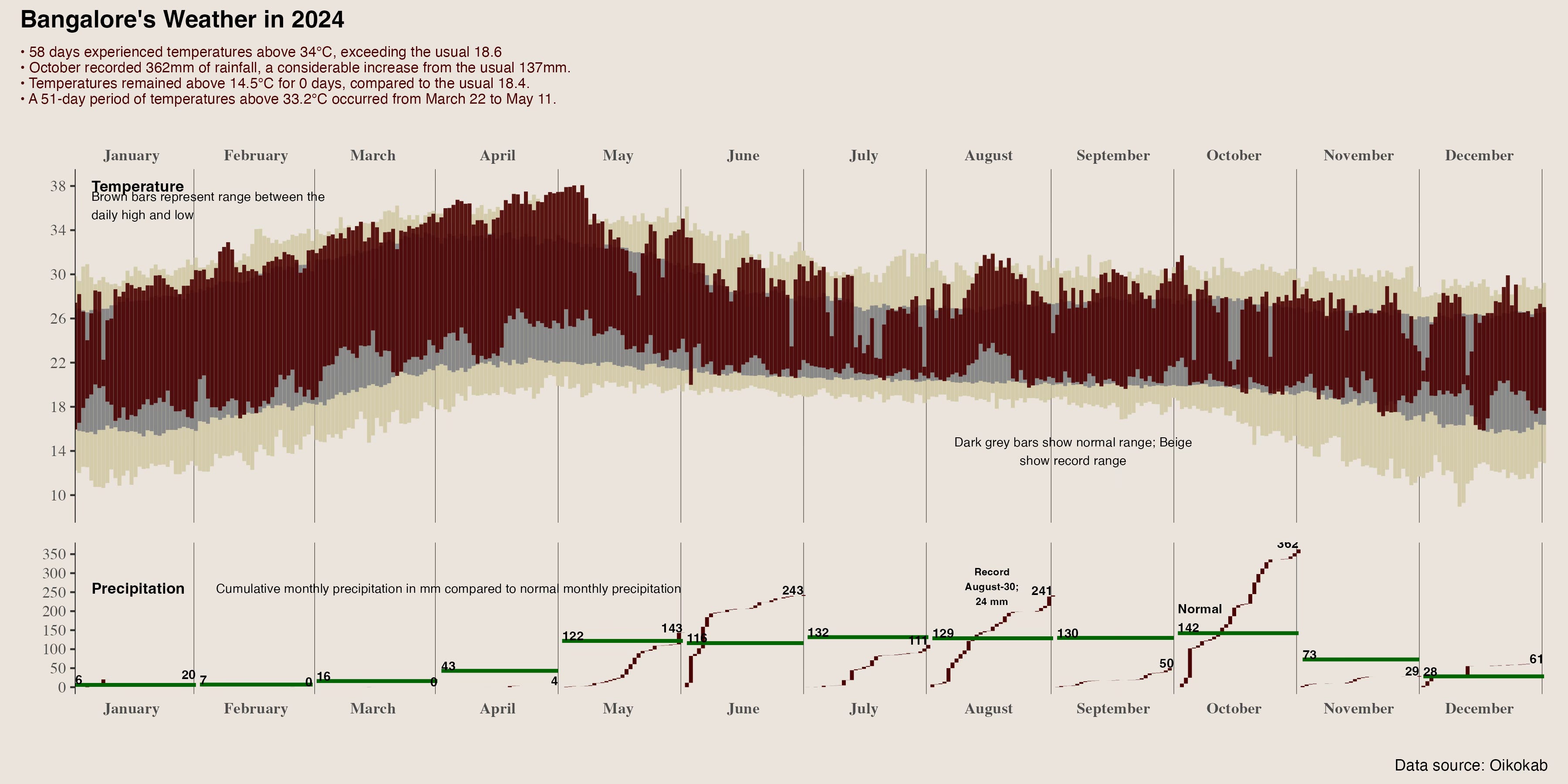
We can still do a lot better - instead of putting the annotations on top, we can put them inline in the graphs. We can significantly improve the annotatiosn. And all that.
However, what this shows is how much can be done with simple vibe coding. I maybe spent 30-45 minutes in total to do this (after the 1 day I’d spent back in 2023 creating the initial thing).
I wasn’t very diligent with using github back in the day, but now vibe coding makes that better as well! Claude produced and updated this repo. This has all the code I’ve written (and claude has written), along with graphs for the last 4-5 years.
Try it out. You’ll need a key from Oikolab, and you’ll need Ollama installed with the model mentioned in the code. I assume your vibe coding tool can help you with this as well!
Update
I wrote the post too soon. I was randomly looking for the original Tufte graphic that I found on his site. I pointed it to Claude and asked it to remake the graph in a way as close to Tufte as possible. This is what it came up with:
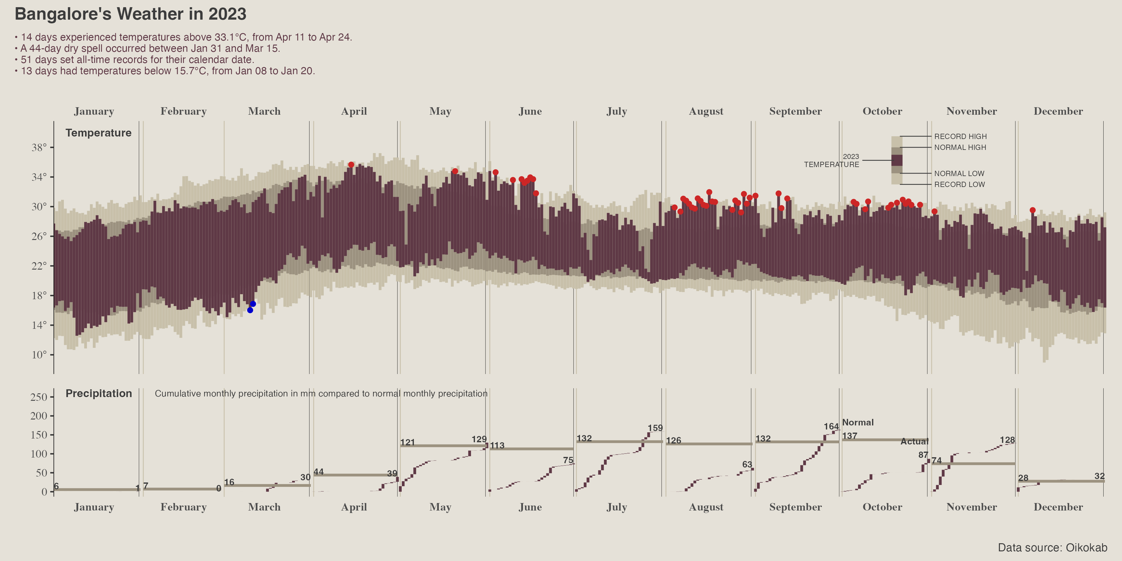
The repo is updated. These are Claude’s changes:
Pushed. Here’s a summary of the design changes to match the Tufte original:- Color palette: Switched to Tufte’s wheat tones — #c8c0aa (record range), #9c9280 (normal range), #5f3946 (actual)- Inline visual legend: Replaced the scattered text annotations with a proper Tufte-style example bar showing labeled layers (Record High/Low, Normal High/Low, Year Temperature)- Record day markers: Firebrick dots for record highs, blue dots for record lows- Degree symbols: Y-axis now shows 14°, 18°, etc.- Month boundary lines: Subtle vertical separators- Unified background: #e5e1d8 throughout
you should publish an article on tips to prompt Claude for this stuff, would love a cheat sheet!