
The Art of Data Science: Chapter Two
Hello!
So there is a second edition, after all! The intention was to have sent it out on Sunday evening, and confuse your internal systems into thinking this is a weekly newsletter (based on one data point), but as with all self-imposed deadlines, this one was breached, and comfortably, so it's unlikely you'll be making any assumptions on the frequency once you receive this!
In any case, I've been overwhelmed with the response to the newsletter, both in terms of subscriptions and feedback. Do keep them coming, and feel free to share this newsletter with someone who you think might appreciate it!
Before we get to the substance of this newsletter, readers might remember that I'd been trying out Python for my last assignment, after over 8 years with R. My verdict now (after finishing this Python assignment), is that Python is great when you're trying to build complex machine learning models, but less so when all you're looking to do is basic exploratory data analysis.
In each of data manipulation, aggregation and visualisation, R clearly scores. On the other hand, if you're working with high dimension data, and think you'll need to fit a reasonably advanced model (doesn't matter what the model is), you're better off picking Python!
Machine Learning and Magic
“Regression is not Machine Learning”. That’s how I began my lecture on regression, that I was delivering as part of a machine learning workshop last year. Soon after the lecture, I was pulled up by a senior colleague who asked me why I thought so. “Because it’s a simple mathematical formula”, I replied, almost rattling off the formula by heart.
It was then that this colleague, an eminent computer scientist, went on to explain how while the formula might look simple, it was computationally complex in high dimensions. The method used, he said, was not very dissimilar from gradient descent that is used to train neural networks, so it was unfair to say regression wasn't ML.
I countered that while the underlying maths might be complex, regression seemed like a simple technique because it was easy to understand while other methods such as neural networks or support vector machines could not be deciphered, making them seem like "magic". This, I argued, made it easier to classify such methods as "machine learning" compared to regression.
My colleague had the last word on this. Some techniques can appear to be magic, he said, but deep down they're nothing but a mathematical formula. In fact, all machine learning is nothing but the application of a mathematical formula on a large amount of data. Sometimes the formula is easily understood, like in the case of regression. Most of the time, though, the formula is rather complex, which makes the results look magical, and makes you believe the machine is "learning".
So the truth is this - "training" a model is basically applying a mathematical formula on a dataset, in order to get a new formula that is more specific. Application of this new formula on a new dataset allows you to predict using that dataset. That's all!
At the next edition of that workshop, my first slide on regression had changed, to something far more benign. I now believe that regression very much deserves to be classified as "machine learning"!
Statistics versus Machine Learning
A few days prior to that machine learning workshop, I was trying to understand how to perform a regression using this Python package called sklearn (the same one where you can build complex models in three line of code), so that I could teach it in class. Using the package to do regression was easy enough, except that I wasn't happy with the output. In fact, the package was returning no output at all, and that made it impossible for me to evaluate the regression model I'd just built.
Anyone who has used any simple statistical package (such as SPSS or SAS or even Excel) to perform regression would be familiar with the "table output" of regression. This details out the confidence limits and p-values of each of the explanatory variables, along with a measure of the overall explanatory power (the R-square). A quick inspection of this table, in terms of the explanatory power and goodness of fit can tell us how effective the regression is, and if we need to modify it in some way (by either adding or dropping or modifying some variables).
It turns out that the Regression output from the sklearn package doesn't offer any of this. All it gives is a model that can be used to predict values for a given set of parameters. Some quick googling gave a hint of why sklearn is designed this way, though the answer seemed rather bizarre to me.
There exists no R type regression summary report in sklearn. The main reason is that sklearn is used for predictive modelling / machine learning and the evaluation criteria are based on performance on previously unseen data (such as predictive r^2 for regression).
While the authenticity of this must be questioned given that I found it on StackOverflow, that people think of a "machine learning method" that is different from a "statistical method" was news to me. Looking at regression evaluation criteria such as the R-square or confidence intervals for variables is part of the process of regression itself, and it's not clear to me why that step is dispensable because you're doing "machine learning"!
The importance of logic in Data Science
In 2012, the Takshashila Institution, a public policy think tank based in Bangalore, hired me to be their Resident Quant. I was asked to teach a course on analytical methods, and apart from teaching public policy students about means and medians, I was also tasked with making sure that they didn't commit fallacies while using data.
That was when I read Darrell Huff's How to lie with statistics (which I spoke about in the previous edition), and developed a lecture on "how not to make decisions based on data". I've used the lecture multiple times since, but the biggest impact it has had, I think, has been on me. Thanks to endlessly lecturing about the logical fallacies one can commit while using data, I've become extremely wary of committing such fallacies as part of my regular work.
So when any data shows any correlations, for example, I work with clients to make sure there exists a "physical interpretation" of the data before concluding causation. I make sure that data I'm working on has been sampled properly, if it is a sample. I try to ensure there is no selection bias in the data we are analysing. And so forth.
And thinking back, avoiding logical fallacies is an extremely important part of drawing insights from data. It is not an easy task, though. For every piece of data you use, you need to understand where it came from, the reason it was originally collected, possible biases in its collection and so on. And for every correlation you derive, you need to make sure it has an underlying "physical meaning" (business managers are usually great at supplying those) before you use it to make business decisions.
Now, all this is relatively easy when you are working with low dimensional data, but when you get into high dimension data territory (where you're drawing data from 1000s of data points while making a decision), it is hard to scale such processes. The best you can do in such cases is to be aware that the analysis might be prone to logical fallacies, and be on out lookout for those!
Chart of the edition
In the last edition, we started off on a "good note", with a chart I had mostly good things to say about. The chart this time is more mixed. I like it because of the way the data has been shown - which creates a new narrative. However, the implementation and data presentation is absolutely atrocious.
I'm talking about this image, which came to my attention via Twitter.
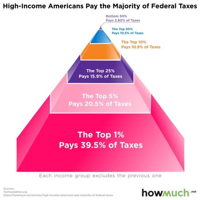
The basic idea is to combat the popular hypothesis that people with high-income (the so-called "1%") don't pay much income tax. So this website called "howmuch" takes data from "taxfoundation.org" and computes the total income tax paid by different "top segments" of the American population.
Now, there is nothing too counterintuitive about the data in this one - with a progressive taxation system that the US has, and with significant inequality (where the so-called 1% earns much more on average than the rest of the people in the country), you would expect the 1% to bear a big burden of the taxes. Just that a narrative has taken root that the rich don't pay taxes, and this website has decided to dispel that myth.
The graph itself, though, is absoultely atrocious. For starters, the human eye cannot measure areas as well as it can measure lengths. Hence, any graph that relies on areas to make its point, such as a pie chart or a bubble chart, is inherently bad. The makers of the above graph, though, are not satisfied with using a two-dimensional image (triangle) to represent a particular data point. They've gone into three dimensions, instead (using a tetrahedron). It is unclear if the numbers are proportional to the height of the pyramid segments, or the areas, or the volumes! It's downright atrocious.
And then, the ordering of values doesn't make sense, either - why would you have the "top 25%" number on the pyramid before the "top 10%" number? The only reason I can think of is that they've arranged layers of the pyramid in descending order of size! It's extremely baffling.
So how can we fix this? One thing to keep in mind is that the visualisation should speak for itself - if the actual numbers have to be put next to the graphic for the reader to understand the graphic, then the graphic has possibly failed (this is true for most pie charts, for example).
What complicates matters here is that the categories are also numerical ranges (top 1%, 1-5% and so on), and that needs to be clearly communicated to the readers. From that perspective, it is good to have a numerical-numerical graph rather than converting one axis into categories.
So I suggest the following graph, which takes the same data and converts it into a line. The same visual effect (of a fat base of pyramid) is not there, but the initial slope of the line is supposed to convey the same message. There are possible enhancements - data labels might help here, for sure. A straight line which indicates what things might have been like if everyone paid equal taxes might also be useful.
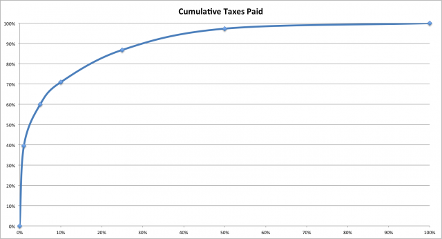
Ultimately, it's all about the message that you as the chart-maker has to convey!
By the way, I made this graph using MS Excel.
Links
My book recommendation for this edition is Benoit Mandelbrot's The (Mis)behaviour of markets: A fractal view of risk, ruin and reward. It is easily one of my favourite books on mathematics and financial markets, and it is highly conceptual. It's some 8-9 years since I bought my copy and I must have read it end to end at least five times.
The most beautiful thing about the book, according to me, is that it is highly mathematical without using a single mathematical formula. Instead, Mandelbrot (and his co-author Richard Hudson) uses pictures - sometimes they're just drawings, and at other times they're graphs, and builds a convincing argument around those. In fact, I've gotten so influenced by the book that sometimes I end up making visual arguments to clients rather than using numbers. On several occasions I've had clients ask me to provide a "less visual and more statistical argument" for some of my recommendations.
It is not often that one newsletter promotes another, but I'm compelled to urge you to read Matt Levine's excellent daily newsletter on financial markets. It is published by Bloomberg, and gives a daily take on everything that you should know about financial markets. I've chosen an extract that will be relevant for readers of this newsletter:
Here is a delightful MIT Technology Review article by Will Knight about "The Dark Secret at the Heart of AI," which is that "the system is so complicated that even the engineers who designed it may struggle to isolate the reason for any single action":
Banks, the military, employers, and others are now turning their attention to more complex machine-learning approaches that could make automated decision-making altogether inscrutable. Deep learning, the most common of these approaches, represents a fundamentally different way to program computers. “It is a problem that is already relevant, and it’s going to be much more relevant in the future,” says Tommi Jaakkola, a professor at MIT who works on applications of machine learning. “Whether it’s an investment decision, a medical decision, or maybe a military decision, you don’t want to just rely on a ‘black box’ method.”
The computer figures out what to do -- how to drive, what stocks to pick -- and then does it. If you asked it why it picked the stocks it picked, it can't say "because they have low price-earnings ratios" or "because I read a nice story about them on Bloomberg this week" or "because I like the cut of the CEO's jib." It can only say "my model looks at a ton of inputs and draws subtle signals from them, which I use to produce outputs." "Which inputs did you use," you ask, and the computer replies: "All of them."
Ok so that's about it for this edition. Keep the feedback flowing. And share the newsletter with anyone you think might find it interesting!
Cheers
Karthik