
The Art of Data Science: Chapter Twenty Five
On Correlation, Linear Models and Excel Formatting
A New Home
Of late I haven’t been particularly happy with tinyletter, which I used to use to send this newsletter. The last newsletter was blocked due to a URL to my own website that tinyletter couldn’t parse, their customer support wasn’t great and moreover I’ve long had a problem with them because their editor hasn’t been great.
In a way, this change is timely since this is the first edition of this newsletter I’m sending out from Bangalore, where I moved back to a month ago after two years spent in London. The nature of this newsletter might change since here I expect to hang out more with business and analytics types, and less with “machine learning” types. Nevertheless, I think it will continue to be useful/interesting to you.
Having asked around a little bit (including I think in the last edition of this newsletter), I’ve zeroed in on Substack. I’ve taken the liberty to migrate all of you to this new home. Hopefully this will work out better, both for you and for me. Now on to the real stuff.
Everything is a linear model
The one course that most people dread in their first term at business school is introductory statistics. Apart from the fact that many of them have to pick up concepts such as probability for the first time after high school, the learning curve is steep as complicated concepts such as hypothesis testing and p-values are introduced in a matter of weeks.
Also what doesn’t help is the large number of models and tests that one needs to learn. Even if you get comfortable with hypothesis testing using normal distribution, soon you have to deal with the T-test, and ANOVA and then a multitude of “non-parametric models”. It is no surprise that introductory statistics is among the least favourite courses for MBA students.
In this light, this blog post offers a nice alternative method of teaching statistics - basically most commonly used statistical tests can be described in terms of linear models. Whether parametric or not, whether we are looking are relationships between two variables or multiple variables, a simple transformation can enable every single statistical test to be modelled in the form of a regression. Do check out the post. It’s fascinating.
Most of the common statistical models (t-test, correlation, ANOVA; chi-square, etc.) are special cases of linear models or a very close approximation. This beautiful simplicity means that there is less to learn. In particular, it all comes down to y=a⋅x+b which most students know from highschool. Unfortunately, stats intro courses are usually taught as if each test is an independent tool, needlessly making life more complicated for students and teachers alike.
This needless complexity multiplies when students try to rote learn the parametric assumptions underlying each test separately rather than deducing them from the linear model.
For this reason, I think that teaching linear models first and foremost and then name-dropping the special cases along the way makes for an excellent teaching strategy, emphasizing understanding over rote learning. Since linear models are the same across frequentist, Bayesian, and permutation-based inferences, I’d argue that it’s better to start with modeling than p-values, type-1 errors, Bayes factors, or other inferences.
This suggests that the order in which statistics is taught to MBA students needs to be inverted. The conventional method is to start with probability and hypothesis testing in term 1, and then move to regression in term 2. The blog linked above suggests this needs to be inverted!
Correlation isn’t everything it’s made out to be
When we are given two variables and need to figure out the relationship between them the most intuitive way of inferring that is by calculating the correlation coefficient. In fact, the word “correlation” has over the years made its way well outside of statistics. “Correlation does not imply causation” should rank among the top phrases used in arguments. Last night I heard a cricket commentator (possibly Kevin Pietersen) use the word “correlation” in relation to the game.
The problem with correlation is that it describes one specific relationship between variables - it basically tests for the existence of a linear relationship between them. And when the variables exhibit a relationship that is not linear, the correlation coefficient fails to capture this relationship adequately.
Nassim Nicholas Taleb (author of Fooled by Randomness and other books) illustrates this well in this tweet (you might do well to ignore the other tweets in the thread - there are rants there). He creates two identical random normal variables, and for one of them he takes absolute value. So if you were to plot them, you would get a y = |x| kind of relationship. If you were to calculate the correlation coefficient in the standard manner, you will get a correlation of 0! However, a cursory examination should tell you that one variable tells you a lot about the other.
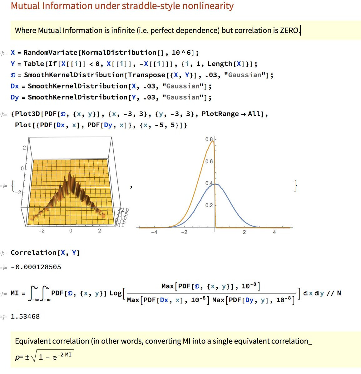
Instead, Taleb suggests that we use “mutual information” (this is measured using joint and marginal probability distributions) to describe the relationship between two variables. There is certainly some merit in this argument.
Maldives leads the way in merging cells
I’m normally not a big fan of the “merge cells” feature in Microsoft Excel. In a lot of cases it doesn’t add value, and it only prevents you from sorting and doing other operations on the sheet. However, I must say I’m pretty impressed with the Maldives Monetary Authority uses the merge cells feature in an L-shaped manner to help us make sense of their data.
This is simply beautiful, and makes things really intuitive. And I hope that other government agencies in other countries learn from this as well in terms of data dissemination and presentation.
The Economist owns up to its mistakes
Old readers of this newsletter might know that I collect bad visualisations. On that tumblr, I mostly collect visualisations done badly in the mainstream media, and comment on how they could’ve been done better.
The Economist has done one better, by publishing a blog post of their own visualisation mistakes over the years. Go through the whole thing. It’s worth your time.
Also it is refreshing because graphic designers are usually possessive about their work and don’t take criticism easily. So it’s commendable that the Economist has come out with owning up its own mistakes.
Conditional Formatting as a visualisation tool
One form of visualisation that is much under-utilised in my opinion is conditional formatting. Sometimes the best form of disseminating data is by just publishing the entire table, though some enhancements can help communicate the message better.
Spark lines are one way to enhance tables. Using commas cleverly to show order of magnitude is another (especially in cases where numbers differ by an order of magnitude). The old accounting method of using red ink for negative numbers can work as well - depending upon the context. And then there is conditional formatting.
In Microsoft Excel, my favourite method of conditional formatting is to use “color scales”, and within that I’m partial to the green-white-red or red-white-green scales (I pick among them depending upon whether a high number is good or bad). The trick here, in my opinion, is to apply conditional formatting not to the whole table, but column-wise (or row-wise if that makes better sense for your data).
This is a good place to plug my piece for the Hindustan Times on India’s Number Four problem in one day international cricket. I looked at the average, strike rate and “relative strike rate” (player strike rate minus team strike rate) for all the contenders for the number four spot in India’s batting lineup, and an intuitive method to show who had high and low numbers was to use column-wise conditional formatting. To their credit, the HT graphics editors didn’t change my formatting. And this is what it came out as:

Note that one look now tells you who was good an bad on each of the parameters. Unfortunately this way of colouring columns in a table is not intuitive in other statistical packages such as R or Python. It’s good old Microsoft Excel that does this best!
That’s about it for this edition. Do let me know what you think of the new form of the newsletter. And don’t forget to share it with whoever you think might like it, and encourage them to subscribe!
Cheers
Karthik