
The Art of Data Science: Chapter Thirteen
Hello!
Hope all is well. This might be the last edition of this newsletter in its current avatar. It is very likely that starting next month, I'll "sell" this newsletter to the consulting firm that I've just set up here in the UK. Knowing me, you shouldn't expect much to change - except that instead of being sent by "Karthik S", this newsletter might be sent by "Bespoke Data Insights Limited".
On to the real stuff now..
Artificial Intelligence beyond games
Two issues ago, we discussed the developments in game playing machines, especially from the "AlphaZero" suite developed by Google's DeepMind. First came AlphaGo which beat the reigning Go world champion. Then came the reinforcement learning based AlphaGo Zero, which beat AlphaGo. And later last year DeepMind came up with AlphaZero which used reinforcement learning to teach itself to play chess and beat Stockfish 8, one of the strongest chess engines. AlphaZero also demonstrated great learning ability at Shogi (Japanese chess).
One reason why chess has fascinated artificial intelligence researchers over the years is because it is a "complete information game". At any point in time, the current situation in the board represents all the information in the game, and there is no guesswork on the part of the player.
In that sense, incomplete information games such as Poker (where a player doesn't see the cards in other players' hands) present the next level of challenge for computers. Poker also has a significant element of game theory in it, given the possibility of bluffing.
Nevertheless, artificial intelligence has made advances in poker as well. In January 2017, a system called Libratus developed by Carnegie Mellon University beat four poker pros over a 20-day tournament. However, other incomplete information games present a challenge.
This article in Quanta , for example, describes a computer game called StarCraft 2, where visibility is limited and players need to make decisions in real time. So far, all attempts at building systems to play the game have been futile. Other computer games have seen better luck, though.
Every time there is a perceptible improvement in the quality of artificial intelligence, such as Deep Blue's victory over Garry Kasparov, or IBM's Watson's victory in Jeopardy or the recent AlphaZero development, people get worried (and excited) that we are getting closer to the "singularity", and that artificial intelligence will take over the world and we will all be soon out of jobs.
However, as the same Quanta article linked above goes on to say, this is unlikely to happen for a while at least. The thing with games is that they are extremely controlled environments, with specific sets of rules and conventions. For an algorithm to do well in "real life", it will need to deal with messy scenarios and inputs - such as a self-driving car dealing with two-wheeler heavy traffic or poor visibility.
To quote again from the Quanta article,
“You have to see, to my mind at least, what’s really a huge gulf between the real activities of thinking, creative exploration of ideas, and what we currently see in AI,” said Josh Tenenbaum, a cognitive scientist at the Massachusetts Institute of Technology. “That kind of intelligence is there, but it’s mostly going on in the minds of the great AI researchers.”
Moreover, as I observe my daughter (who is almost a year and a half old) learn about life at the same time as I learn about machine learning, I realise there is a marked difference between the way machines and (young) humans learn.
For starters, humans need far fewer data points. My daughter had to be shown only a handful of pictures of cats for her to start identifying cats (though I do "train" her from time to time by pointing out that small dogs aren't cats, for example). Secondly, humans can abstract a lot more. My daughter, "trained" on two or three pictures of elephants, had no difficulty recognising a cartoon elephant as an elephant - I'm not sure a machine can display the same abstraction. Thirdly, humans don't need to be specifically instructed to combine two or three things that they've learnt for an insight, unlike machines!
Artificial Intelligence Gaydars
In the previous section, I mentioned that every time there is some development in machine learning, people are quick to call for doomsday scenarios where computers will take over the world, rendering us jobless or worse - wiping out the human race.
About a year back, Yilun Wang and Michal Kosinski of the Stanford University Graduate School of Business published the pre-print of a paper titled "Deep neural networks are more accurate than humans at detecting sexual orientation from facial images". Wang and Kosinski took some 35000 odd faces of gay and straight (white) people from a dating website, and built a deep learning algorithm to detect sexual orientation. As it turned out, their algorithm had amazing accuracy (81% for men and 71% for women).
The paper came out (no pun intended!) in the Journal of Personality and Social Psychology last month, and as you might expect, the doomsday predictions have started. Not unexpectedly, the paper has become controversial enough for the authors to publish a detailed "authors' note".
While an algorithm that can supposedly detect sexual orientation from someone's face can seem scary indeed, the question is if the algorithm works outside of the sample of data where it was tested.
As Dan Simpson (writing on Andrew Gelman's blog) points out, the entire dataset on which the paper was based comes from a dating website, and that itself presents significant biases. Simpson writes,
2. The training data set is a terrible representative of the population. The testing set is even worse.
There are other problems with the paper. My favourite is that they find that facial brightness is positively correlated with the probability of being gay and posit a possible reason for that is that is that an overabundance of testosterone darkens skin. Essentially, they argue that straight people are a bit dull because they’ve got too much testosterone.
As much as I enjoy the idea that they’ve proposed some sort of faggy celestial navigation (you’re never lost if there’s a gay on the horizon to light your way to safety), it’s not that likely. More likely, gay men use more filters in their dating profile shots and we really should sound the correlation is not causation klaxon.
There are many other problems with the paper, which haven't been necessarily addressed in the authors' note. Do read the entire blog post by Simpson - it illustrates the traps we can get into when we try to outsource all our intelligence to machines.
Astrology
Speaking of outsourcing all our intelligence to machines, I wrote in Mint On Sunday about how the way data science is largely practiced nowadays is no different from astrology. It started with a flippant comment from my wife six years back (which I'd then ignored), but looking at how so many data scientists simply "stir the pile" while trying to find insights, I couldn't but help think of this analogy.
It's a long piece. On social media it's drawn a small degree of outrage, about how data science is scientific and astrology is anything but that. I expect most readers of this newsletter to like the piece!
Pizzas and jellybeans
About a decade back, a book called "mindless eating" got published, written by "food psychologist" Brian Wansink, PhD (sic). I haven't read the book. In my opinion, the fact that the author wanted to show his academic credentials on the book cover itself suggested some kind of snake oil.
In any case, as it turned out, it was found later on that most of the research that underlies the book was wrong, and some of the more important papers have been redacted. Andrew Gelman calls it "pizzagate" and has written multiple posts on his blog about the topic. Basically this deals with a common problem in statistical analysis - the results cannot be replicated on an independent data set. One problem was especially funny - they had "lost the original data".
Buzzfeed wrote a lengthy article on the subject recently, pointing out all the problems with the research underlying the book. Basically a lot of it is bunk, and the authors did a lot of "data mining" (in the original sense of the term) to get the results they obtained and published.
Alex Tabarrok of Marginal Revolution put it best: "In essence, Wansink all but published a study finding green jelly beans cause acne".
Visualisation for dummies
The infographic of the edition is rather simple - a scatter plot posted by Adam Grant, Wharton Professor and author of Originals, Plan B, etc. The reason I highlight it is the way it's communicated, including the explicit mention of "45 degree line".
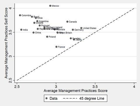
Grant's hypothesis is that self-score is uniformly higher than the "score", and a 45 degree line on the scatter plot is a good way to explain this point. And by explicitly drawing attention to the 45 degree line in the legend, he forces the reader to notice that all data points lie above that, and that the data represented on the Y-axis is always higher than the X-axis data point.
It's another matter that he doesn't bother to mention what the data is supposed to represent, where it comes from, etc. (even in the accompanying text) - which makes this less useful than it could have been.
Junk Charts Trifecta checkup
I've long been a fan of Kaiser Fung's blogs (Junk Charts and Numbers Rule Your World), and during this period of fandom, I had bought his book Numbersense on my Kindle. I'd abandoned it then, but last week I started a concerted effort to read the book. It starts off well but very quickly goes downhill. Examples aren't well chosen, it's all too "obvious" and the language is dry.
Instead, if you wanted a book on how to make sense of data, and what pitfalls we might fall into while analysing or communicating with it, go back to 1954 and Darrell Huff's How to Lie With Statistics. That remains a classic.
Back to Fung, one of the nice things he has on his blog is the "junk charts trifecta framework", which is a simple framework to evaluate a piece of visualisation. It basically consists of three components,
The Trifecta Checkup involves only three investigations:
What is the QUESTION?
What does the DATA say?
What does the VISUAL say?
Ideally, the results of all three investigations are one and the same.
Read the post. And then every time you produce a visualisation, ask yourself where it falls on this framework. It's not a hard-and-fast rule, but a nice way to make sure your visualisation and data are relevant to the problem at hand.
Ok that's it for this edition! Feel free to forward and share this newsletter. If you think someone you know might enjoy this, ask them to subscribe.
Until next time, then!
Karthik