
The Art of Data Science: Chapter Seven
Hello.
I know this has taken a long time coming. As it happens, I've taken up a full time job, and that takes up most of my time nowadays. That the job has to do with analytics, and that I don't want to write too much about work here, means that a lot of topics that I would've otherwise written on remain taboo, so I have to wait to collect enough stuff I can actually write about before I can write one edition.
Now that this is out of the way..
Being Multilingual
In the very first edition of this newsletter, I'd written about my struggles with using Python as a tool for data analysis. I'd written about the difficulties with graphing, accessing and setting subsets of data frames and exporting stuff to PDF.
As it happens, now, once again I've been requested to use Python for my data analysis at work, and to my own surprise, I seem to be loving it this time round. I use the Jupyter interface to do my analysis, and have discovered this package called plot.ly that allows me to make some pretty good-looking graphics. And it's so much easier to use Python to connect to databases and deal with formats such as JSON (compared to R).
The challenge, for me, though, is "being multilingual", for I've decided to continue to use R for my non-job analyses. I don't know if it's because I'm becoming old, but there are times when I have immense trouble remembering the precise syntax of each language (the fact that both Python and R are interpreted, however, means that the mistakes are caught immediately and I get "woken up").
The last time I was simultaneously using multiple programming languages was back when I was at IIT, when I'd use C/C++ when I could, and was forced to use Java for all my assignments (professors there had an inexplicable love of GUIs, and i continue to hate Java and its graphics to this day). I don't know if it is just age, or if C++ and Java are far more different than R and Python, but I don't recall an earlier time when I had trouble context switching between programming languages.
Oh, and I have this theory about why Python might "win" as a tool for enterprise analytics and data science - it has to do with machine learning in three lines of code. If your organisation is doing anything that remotely requires machine learning, you're far better off using Python than any other programming language. And if some part of your codebase exists in Python, having another part exist in another programming language can result in software engineering nightmares. And since Pandas can do most of what R can do, the optimal solution is to use Python.
This reminds me of the "minority rule" (read this brilliant essay on the subject by Nassim Nicholas Taleb). Machine learning guys are the "intolerant minority" because what takes them three lines in Python (and three very similar lines for whatever method they use) takes a lot more, and lot more diverse, code in any other language. The cost of their moving to another language is far higher than the cost of others moving to Python. And so the rest simply come around!
Oh, this is completely unrelated, but the title of this section comes from an award-winning essay written by Prithwiraj Mukherjee, a professor at IIMB.
Slicing and dicing
I didn't last too long in my first ever full-time job, but one thing I remember from it was this one fairly senior guy who was obsessed with the phrase "slice and dice" (along with appropriate hand movements). I was handling data for some project we were doing, and I remember him using the phrase each time we discussed my work.
Anyways, I've come across the phrase multiple times since then, and it's uttered mostly by managerial types rather than data types (no pun intended).
Most off-the-shelf "Business Intelligence" and dashboarding systems are pretty good at offering tools to slice and dice data. All you need is to load up the data using a script (most of these systems conveniently allow you to use SQL queries to load up data), and a manager can slice and dice it to her heart's content.
In the non-public Chapter Zero of this newsletter, I'd abused Tableau saying that it's not a great visualisation system because it gives the consumer too much choice, and it's hard to use it to get across a specific message. In hindsight, I'd completely missed the point of Tableau - it's not a visualisation system. It is a tool meant for internal managers - who usually have excellent context - to slice and dice the data for their own understanding without needing to be too technical. And if they find something interesting, they can quickly make that into a report for the consumption of others - again without getting technical.
The problem with these systems, though, is that it is difficult to do more. Let's say you want to include some statistical test or a small algorithm to produce the data in your dashboard - that your colleagues can then slice and dice. The way most systems are set up, all the pre-slice-dice steps are done using SQL, and things can get rather messy there.
SQL
SQL is a great query system (I remember getting insanely excited when I'd first learnt to use it back in 1998), but I've come to believe it's best used for doing some basic querying and transformations and summarising and joining (especially when the size of the data is large), and then getting the result down into an interpreted statistical analysis system like R or Python-Pandas or Julia and doing all the "gymnastics" there.
It's not that you can't do complex stuff in SQL - there are several data scientists who have built their careers doing just that - but for me the big problem with using SQL is that it's like playing blindfold chess. You can't see the "board" after some moves have been made (a part of the logic has been built), and you need to build the rest of the logic based on your view (no pun intended) of what the board possibly looks like.
This not only increases the chances of errors, but also makes the code hard to debug - the same "blindfold chess" metaphor applies to debugging as well.
There's one other major reason I believe SQL is "improper" for doing stats or data science - there's no straight way of calculating the median of a dataset! I'll talk more about means and medians in a subsequent edition, but it's fairly common that you'll want to aggregate some quantity using medians, and not being allowed to do that can severely handicap you. In fact, that is my big problem with Microsoft Excel as well - pivot tables don't allow you to aggregate data using the standard deviation (interestingly, both Excel and SQL use the word "average" to denote "mean". Mathematically, "average" can refer to any measure of central tendency - mean, median or mode).
Sankey Diagrams
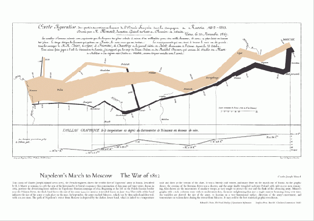
I recently learnt about this interesting kind of visualisation called "Sankey Diagrams" (it has nothing to do with the Bangalore engineer after whom the Tank and the Road have/had been named). These diagrams are used to depict flows, with what look like (and conceptually are) pipes connecting up different entities on the graph (pun intended). The graphs can sometimes look unwieldy, especially when there are too many pipes, but when done well, this is an effective visualisation to show flows.
The most famous Sankey Diagram, of course, is the famous chart showing Napoleon's march into Russia. Of course, flow here is not conserved (soldiers kept dying), so the pipe thins out, but this is widely regarded as one of the best ever pieces of data visualisation.
Interestingly, some standard graphics packages (including the aforementioned plot.ly) offer Sankey diagrams as a "standard" graphical method.
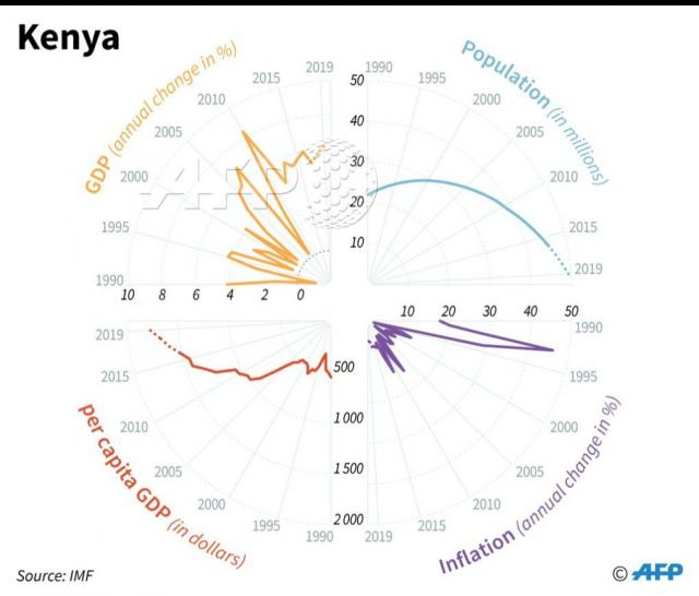
Chart of the week
was sent in by reader Abhishek Upadhya. I won't even attempt to understand what the chart is trying to say.
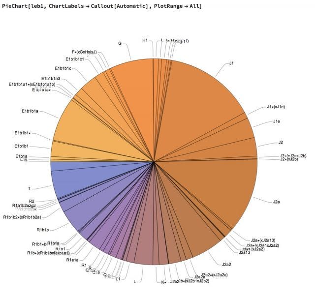
Oh, and he's another - contributed by Nassim Nicholas Taleb (mentioned earlier in this newsletter). A great illustration on why pie charts suck.
Letters
Following the last edition, I received a few letters, the most interesting of which came from Bargava Subramanian. First, he sent me this excellent set of links on the smart contract currency Ethereum. Then, he explained to me the concept of cross-validation, which is used to make sure that you're not building the model optimised for a particular combination of a training and test data set.
I thought his explanation might be useful for all readers of this newsletter, so quoting him in full here (with permission):
Say, we are doing a classification problem with a 100k data points. A variety of models can be fitted to that dataset. The goal of the training process is to select a model that can then be used in production.
In a classical setup - the data will be split into two: Say 80/20. So, 80k for training and 20k for testing. Why are we doing this? To report the "generalization" error. We need some measure to report on how the model will behave out-of-sample.
Now, there's a possibility that the 20% data we selected happened to be at one of the spectrum (too good or too bad). One way to overcome this is doing K-Fold cross-validation.
The data is split into k-folds. Let's say we are doing 5-fold cross-validation.
So, the entire training data is split into 5. 20k in each fold. Now, with 4 of the folds, we build a model. We score it on the remaining 1 fold(that wasn't used for trainining) and report the error. Now, we can run this 5 times - keeping a fold of data away - and using the remaining data to train and score on the left-out one.
The mean of these 5 different left-out folds' error metric is now reported as the generalization error.
How many folds to select? A tricky question. 5 or 10 folds is the rule-of-thumb. There are a few variants on this (Say: go all-extreme. Only one data point as test. Remaining is train. Repeat this n times - and report the error. This is called leave-one-out.).
So, in this case, we will run 5-fold CV using different models and choose a model that has the lowest CV.
Ok that's about it for this edition. Oh, my book Between the buyer and the seller has been printed and will be out early next month. Will keep you posted on that.