
The Art of Data Science: Chapter Five
I know this one's a bit late - it's been close to a month since I sent out the last newsletter. I don't know what habits changed, but it's been that long since I found enough interesting stuff to construct a full newsletter! Anyway, here goes.
Letters
In the last edition, I'd described the book Foundations of Data Science as "unless you're doing a PhD in data science, you shouldn't bother reading this". A reader (the same person who had recommended this book in the first place) wrote back saying that it's intended to be an undergraduate text. I really don't know how to react to that.
Another reader, in response to my comments on whether we should understand the models we're building, sent a link to some efforts on visualising Deep Learning systems, in terms of understanding how they actually learn. This is especially useful in computer vision kind of applications. Also check out this Youtube video.
Smelling Bullshit
A few years ago, when we designed the Data Journalism course at the Takshashila Institution, we decided that the introductory lecture had to be about "smelling bullshit". In order to make sense of data yourself, it is important that you identify when someone is bullshitting you using data. So we prescribed The Tiger That Isn't and How to Lie With Statistics, taught about logical fallacies (such as correlation being mistaken for causation) and explained how data could be used to mislead.
Anyway, it turns out that we're not the only ones worried about bullshit. A course at the University of Washington in Seattle also goes by the name of "Calling Bullshit in the Age of Big Data", and the demand for it is rather high, going by this report in the New Yorker, which also summarises some of the key insights from the course.
For someone who has taught a course on Smelling Bullshit, there isn't that much new there, but it's a good summary on what questions to ask when someone makes an argument using data.
Drunk looking for keys under lamppost
The standard method of problem solving using data involves starting with a business problem, which you then break down into sub-problems and hypotheses and then look for the data that you need to test out these hypotheses. This way, you are not constrained by the data that you have (there is a popular story of the drunk man looking for his car keys under the lamppost. When someone asks him why he's looking there, he answers that he's concentrating his search there because it's too dark elsewhere).
While conducting some corporate workshops some years back I even formed a "six step method of solving problems using data" which is nothing but the scientific method - starting from business problem and then going to data. I even made a slideshare of it (forgive the colour scheme - I don't know what I was thinking back then!).
Anyway, there is one "drunk" (who helpfully used to go by the name of Booz and Company) who precisely advocates looking for keys under the lamppost. This is in a report on the use of big data in the telecom industry, The report says,
This method does have benefits, but it is unlikely to lead to any serendipitous and surprising results — and it is difficult to execute until a company has demonstrated mastery in its use of data.
Instead, operators should begin with the data itself, experimenting with what they have on hand to see what kinds of connections and correlations it reveals
The good thing is that Booz admits that this goes against conventional wisdom. But I'm not convinced by their line of argument. Apart from the obvious problem of being restricted in scope when starting with the data (ignoring area outside the coverage of the lamppost), the problem with starting with data is that you can sometimes run around endlessly in circles without going anywhere. There is also the matter of coming up with spurious correlations, which are less likely to arise when you've started from the business problem.
Once in a while, yes, starting from the data does yield benefits and surprising results, but it's not common enough that I'd put it down in writing, in an industry report no less.
Certificate Program in Machine Learning
Bangalore-based Jed-I is offering a 12-week certificate program in Machine Learning. Most of the sessions will be online, but there will be two in-classroom workshops and a capstone project. The course content looks rather impressive.
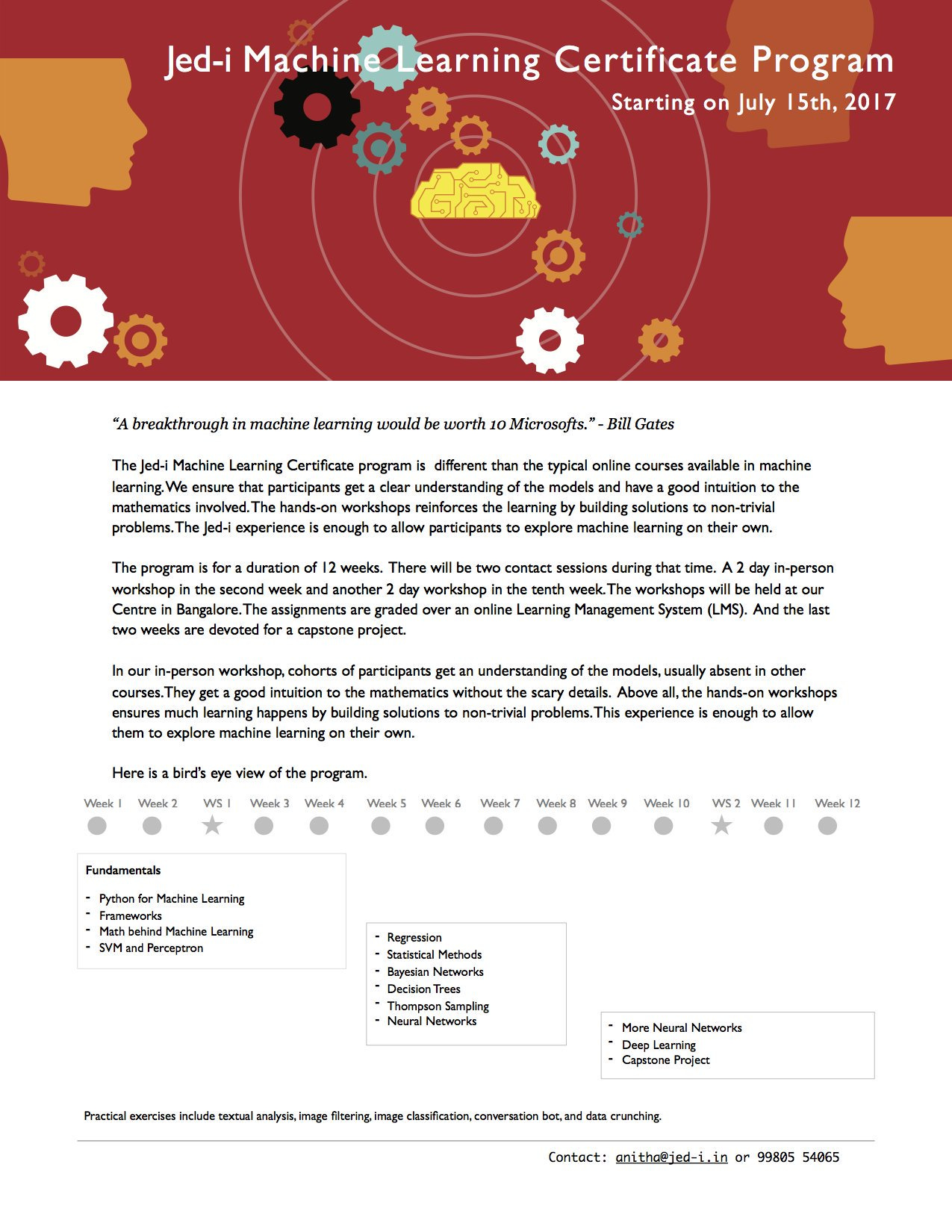
Now, I know these guys rather well, and personally vouch for this course (Disclosure: last year, Jed-I offered a condensed version of this for corporates, and I was a member of the faculty that taught that).
What sets this course apart is that you'll not only learn how to implement all these methods (remember that it's three lines of Python code!), but also learn the underlying maths behind them. And V Vinay, who leads the course, is an excellent teacher of maths and computer science.
The course costs ₹50,000 which might at first sight appear expensive, but I definitely think there's plenty of value there. You can sign up using this form.
Graphics
The graphic that I intended to talk about in this edition seems to have pulled down by the creator (and I didn't have the sense to screenshot it while it was still available). It was a map where regions for which there was no data were completely left out, showing India in an incomplete manner. My apologies.
Instead, here's a nice gif that shows how you can make Excel tables look good.
Some gloating
Given that I've been writing a data column on elections for Mint for four years now, I couldn't help but analyse elections in the country where I'm living now. The UK went to polls earlier this month, and early opinion polls all called for a comfortable Tory victory. I decided to use the models that we use for forecasting elections in India and apply them to the opinion polls here in the UK.
Three days before the elections, I wrote:
In fact, going by the ratio swing model [....] a hung Parliament looks increasingly likely.
The UK is headed for interesting times.
Guess what happened! :)